Making care-home availability easier to find
An SMS survey and dashboard prototype for making care-home availability easier for hospital staff to discover.
A care home can have an available bed without the hospital looking for a placement knowing about it. With Vince Bartle, Srishti Gupta, and Flora Shen, I worked on a prototype to make that information easier to collect and navigate.
Think of it as a shared availability board: care facilities report openings, and hospital staff use those updates to identify places to contact. The goal was to reduce the search for information, not to automatically decide where a patient should receive care.
My contribution
I worked across the SMS survey, availability-data cleaning, and Python/Streamlit dashboard prototype as part of the team. That connected three practical questions: how to collect an update, how to make inconsistent records usable, and how to help someone find a relevant facility in those records.
What we built
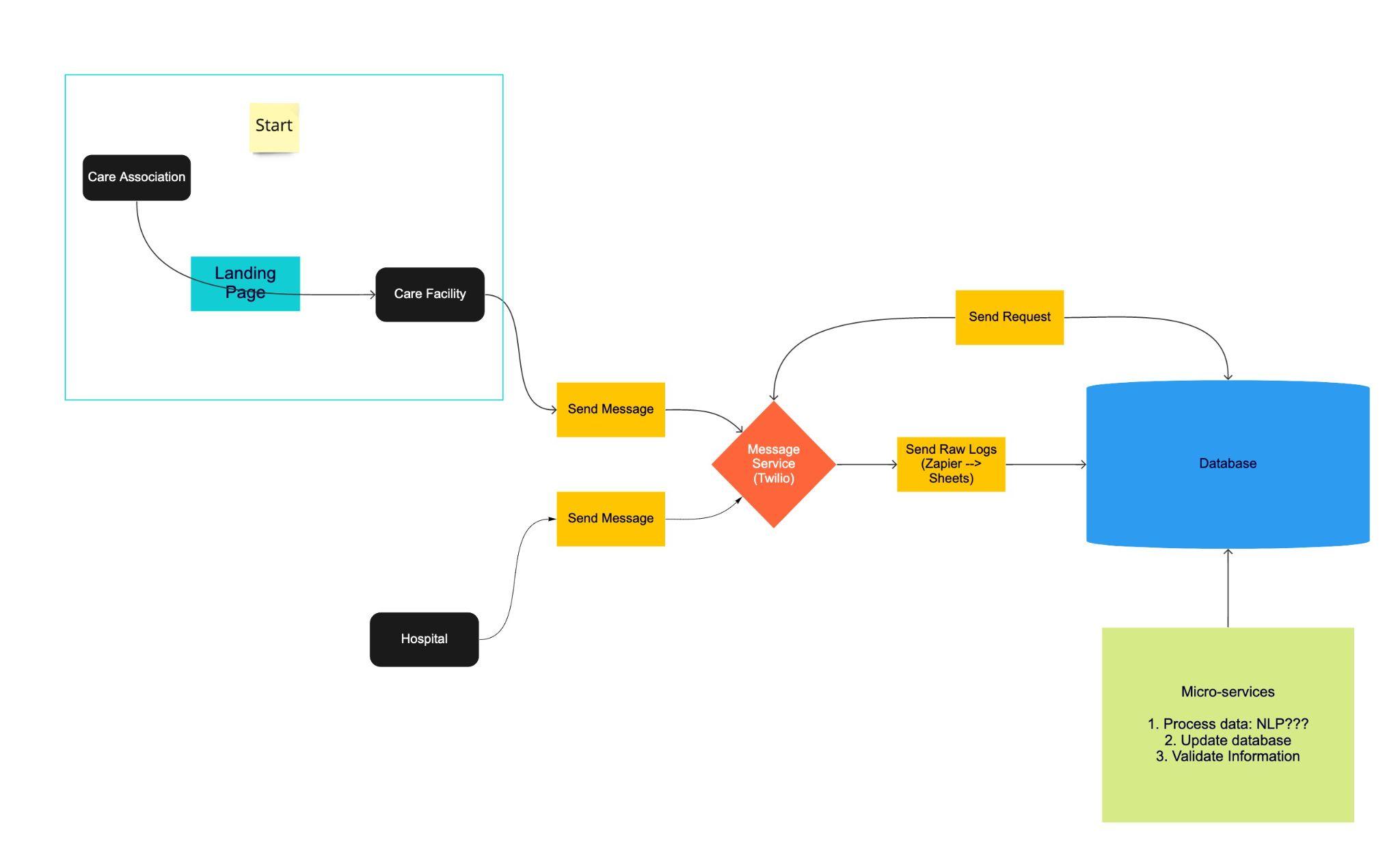
- Collect updates by text. We built a Twilio Studio survey with closed and open-ended questions. SMS gave facilities a way to respond without requiring a new electronic health-record system. The initial flow asked 15 questions based on fieldworker and clinical requirements.
- Organize historical availability records. I worked with Python and pandas notebooks to inspect extracted care-home tables and group compatible layouts. In the adult residential-care data, the prototype combined 16-column tables, standardized their column labels, and sorted records by snapshot date. Other notebooks explored reported vacancies and capacity.
- Make the records inspectable. The Streamlit prototype let a user choose a field and a value, inspect the matching rows, and plot reported male and female availability. This was a working snapshot-data explorer, not a live bed-booking or patient-matching system.
The engineering problem behind the interface
A list of beds is only useful if its records can be interpreted consistently. Historical tables arrived with different shapes, so the cleaning work checked their structure before combining them. Keeping the snapshot date alongside each record preserved when the information was reported. An opening in an old snapshot should not be mistaken for a bed available today.
The archived dashboard code shows that processing path directly: select compatible tables, combine them with pd.concat, sort by Snapshot Date, filter rows, and display them with st.dataframe. The SMS-to-dashboard connection was the intended end-to-end workflow; the surviving app reads saved availability data rather than demonstrating a live connection to incoming messages.
What the early survey revealed
At the midpoint, the team reported 14 users and 235 messages for a 15-question survey. Reported completion was 57%; the other 43% stopped at the first or second question. The team also observed confusion when a landing-page link appeared in the opening message.
These early observations made the interaction itself an important design problem: collecting a useful answer requires a survey people can understand and finish. The figures describe a small interim pilot, not evidence of improved patient placement or shorter hospital stays.
Where the project ended, and what comes next
The available materials document an SMS survey and small pilot, data-cleaning notebooks, and a dashboard prototype. They do not establish a production deployment or a completed placement service. The midpoint plan called for more data collection, more robust message handling, and natural-language processing (NLP) to interpret free-text answers and skip questions already answered. Those NLP features were proposed, not demonstrated results.
A useful next test would compare a shorter, clearer survey with the original flow, then check whether staff can find and confirm relevant openings from the resulting records. Completion, freshness, and accuracy of the updates would matter before measuring any effect on placement time. The early lesson was straightforward: a useful dashboard starts with information people can successfully provide.